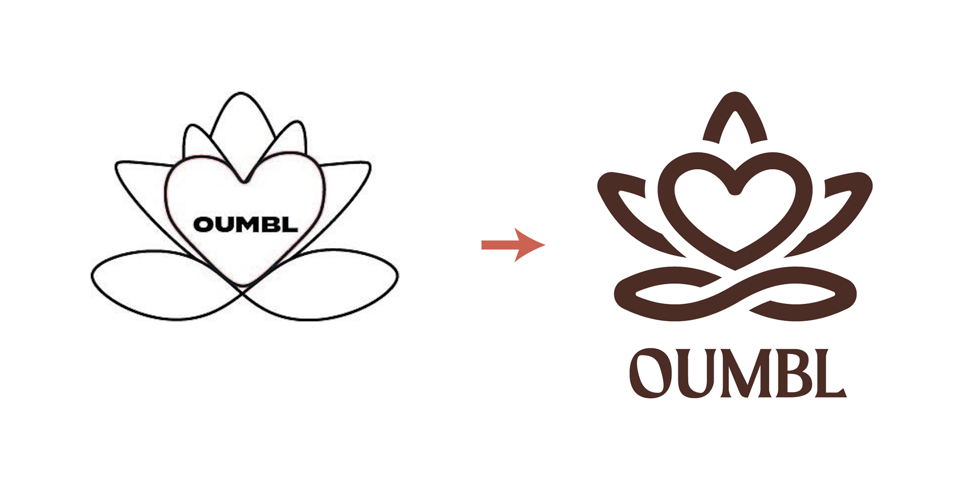
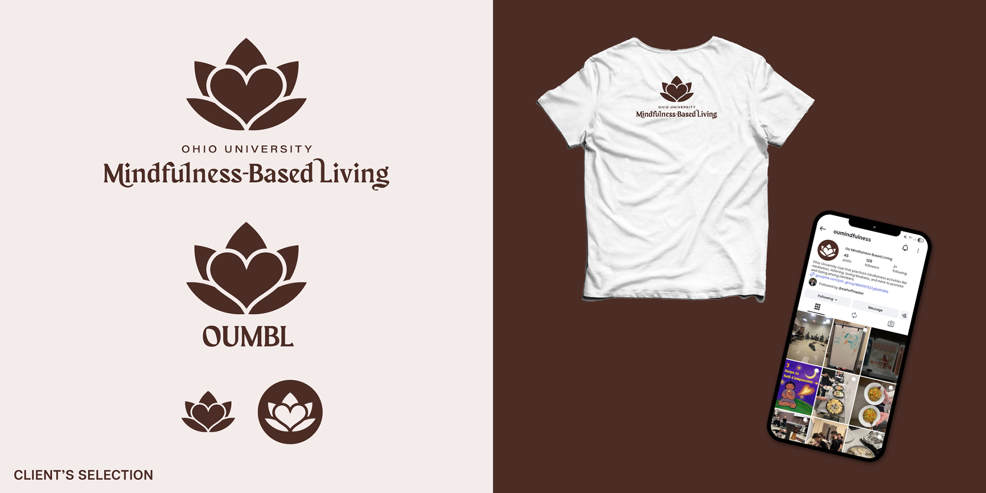
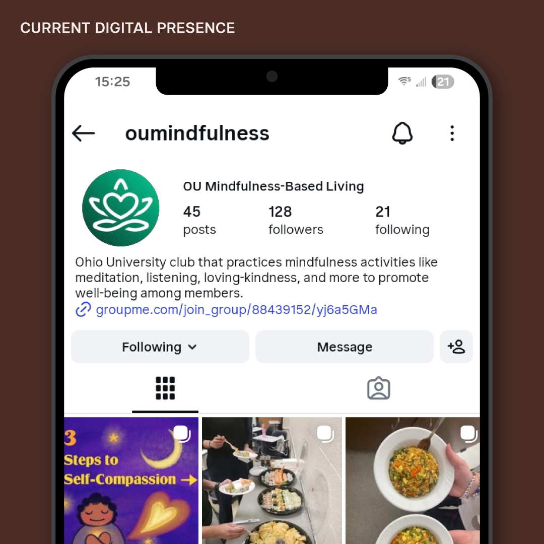
Challenge
As a newfound organization, OUMBL sought to attract as many attendees as possible. I proposed to redesign the logomark to better communicate a sense of establishment, following standard conventions such as vector formatting, scalability, and readability.
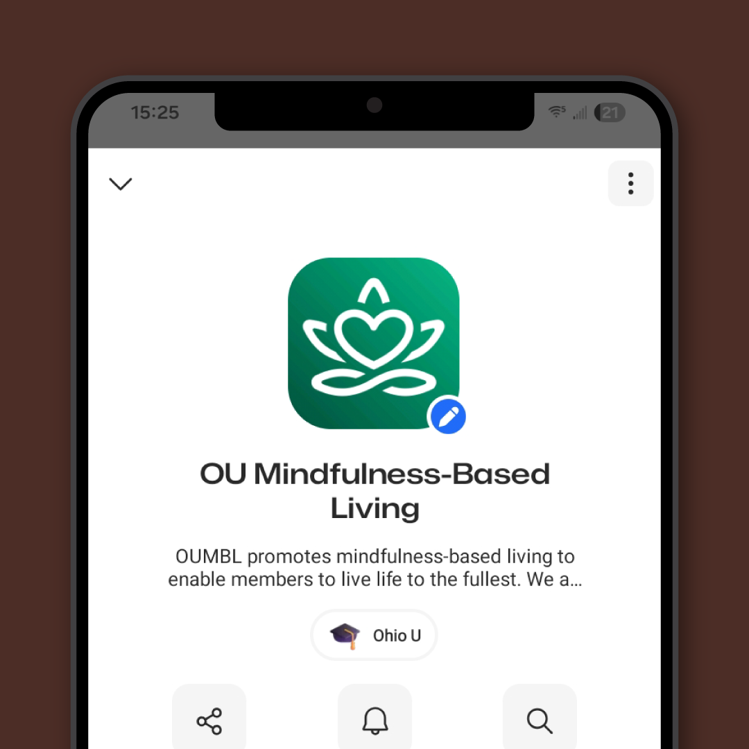
Design Solution
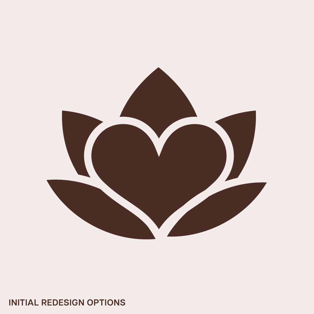
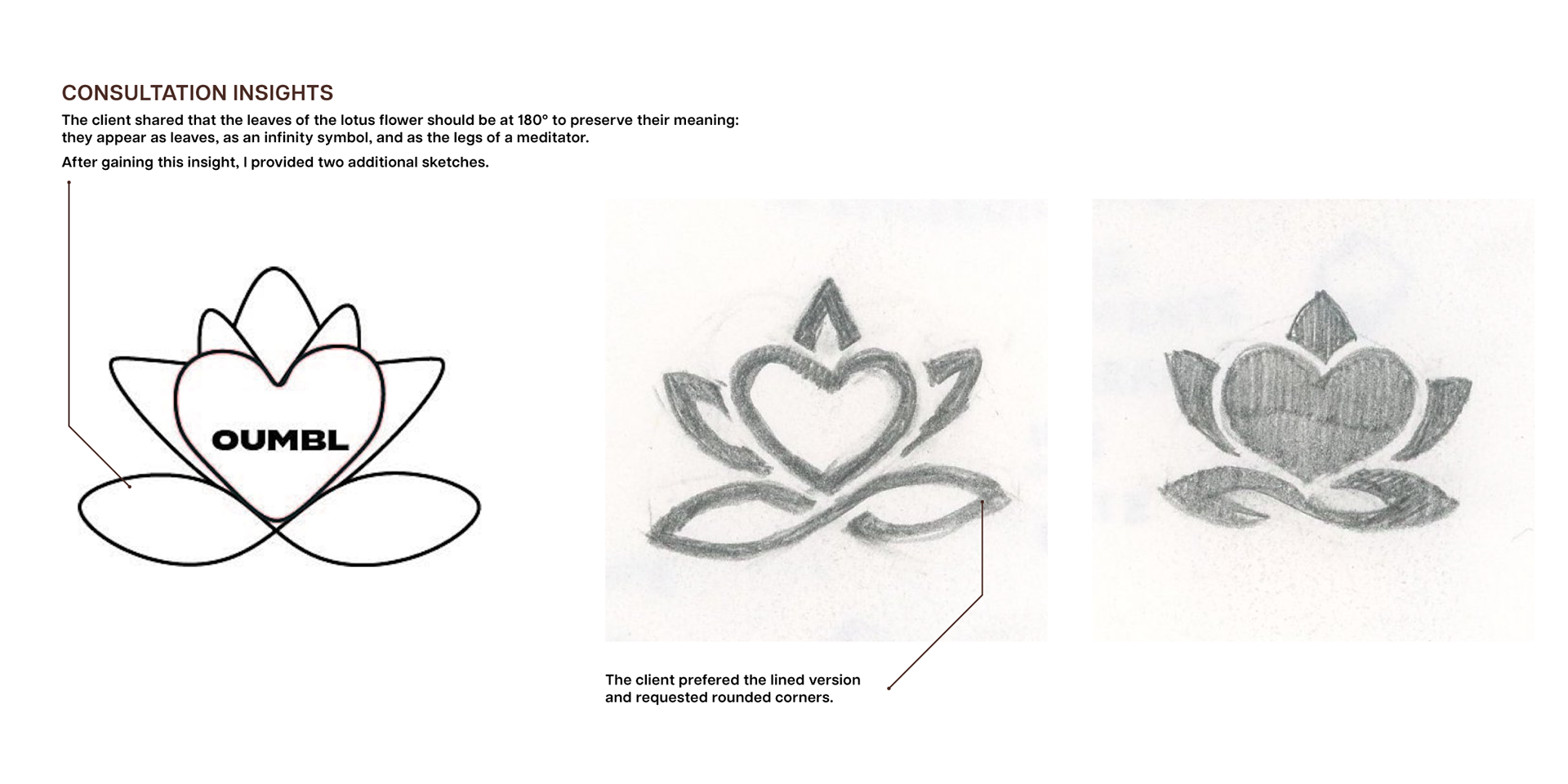
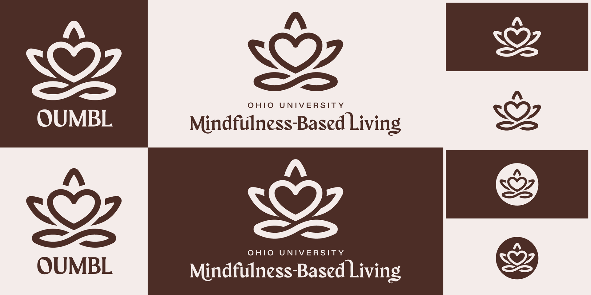
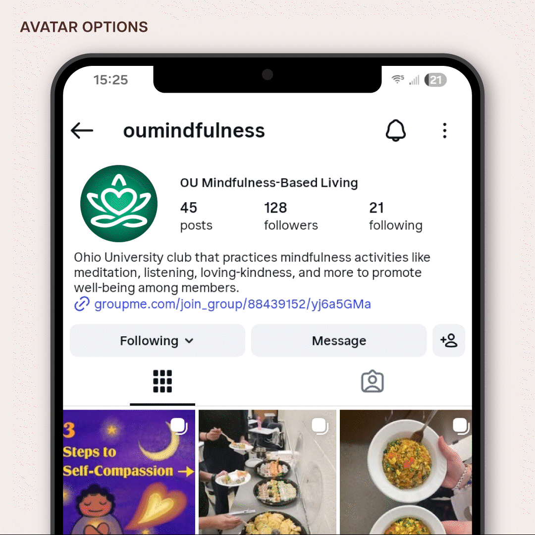
I offered three initial logomark options to the board. After receiving feedback and collaborating on art direction, I iterated a final logomark, primarily used across OUMBL's digital presence.


Hey.