SUMMARY
The Music Industry Summit, a major annual music industry conference held at Ohio University, utilizes a different visual theme each year for all of its branded promotional graphics. I proposed a visual concept accompanied by the following series of designs and mockups.
This project was completed for the course Art Direction.
PROCESS
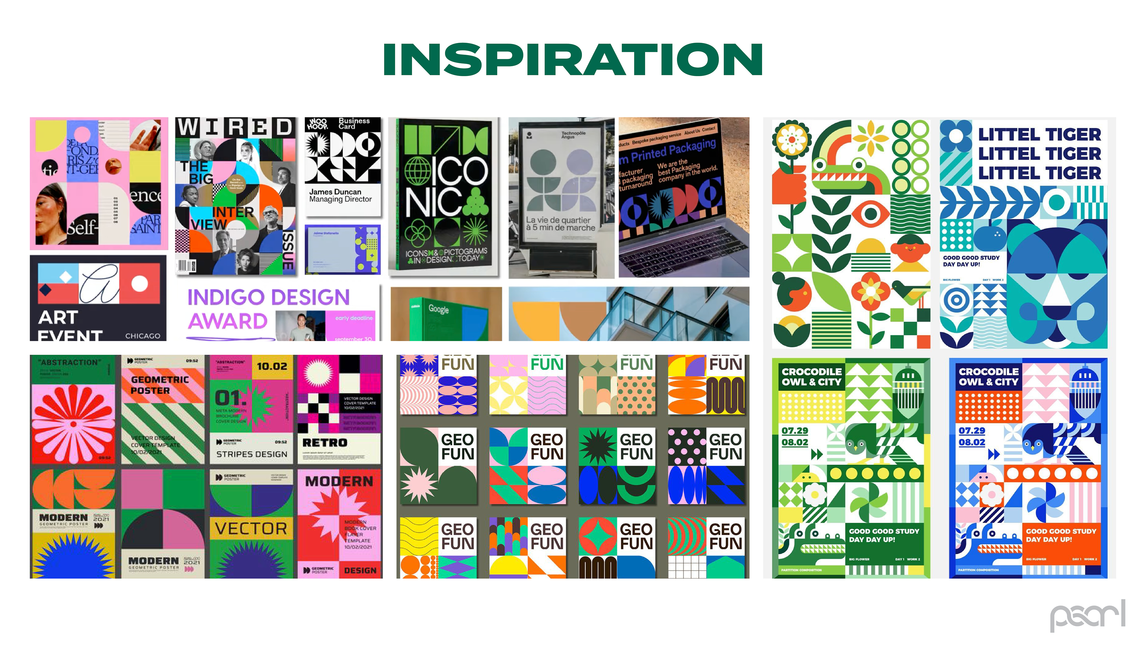
I began by researching design trends and composing three moodboards, each with an accompanying design drawing inspiration from them. My critique session indicated I should pursue the third option.
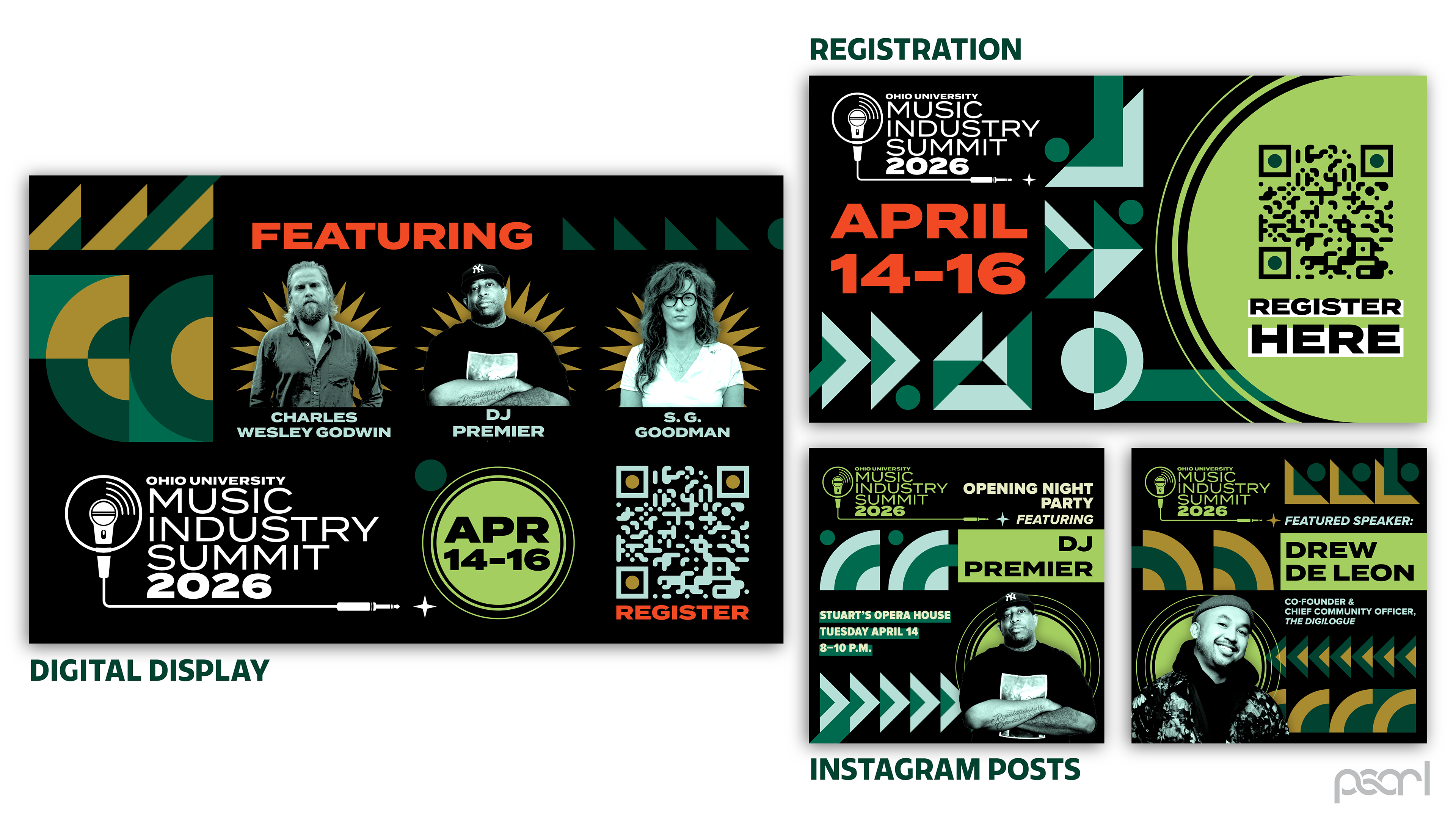
My inspiration drew from modern influences of highly gridded, geometrical designs. They have a bold, attention-grabbing appearance balanced with clean, direct compositions, a great opportunity to incorporate the simplicity of the Ohio University branding.
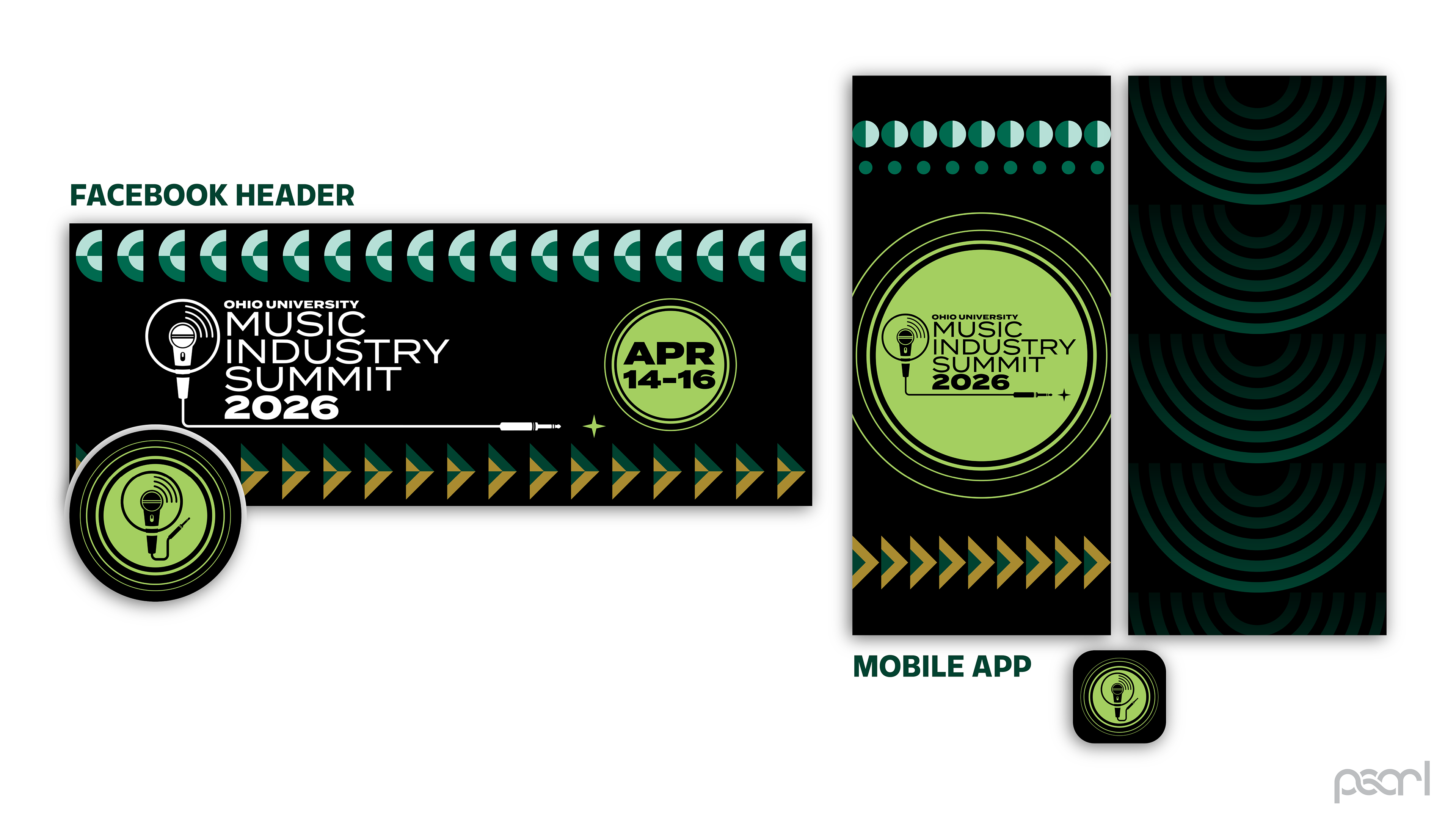
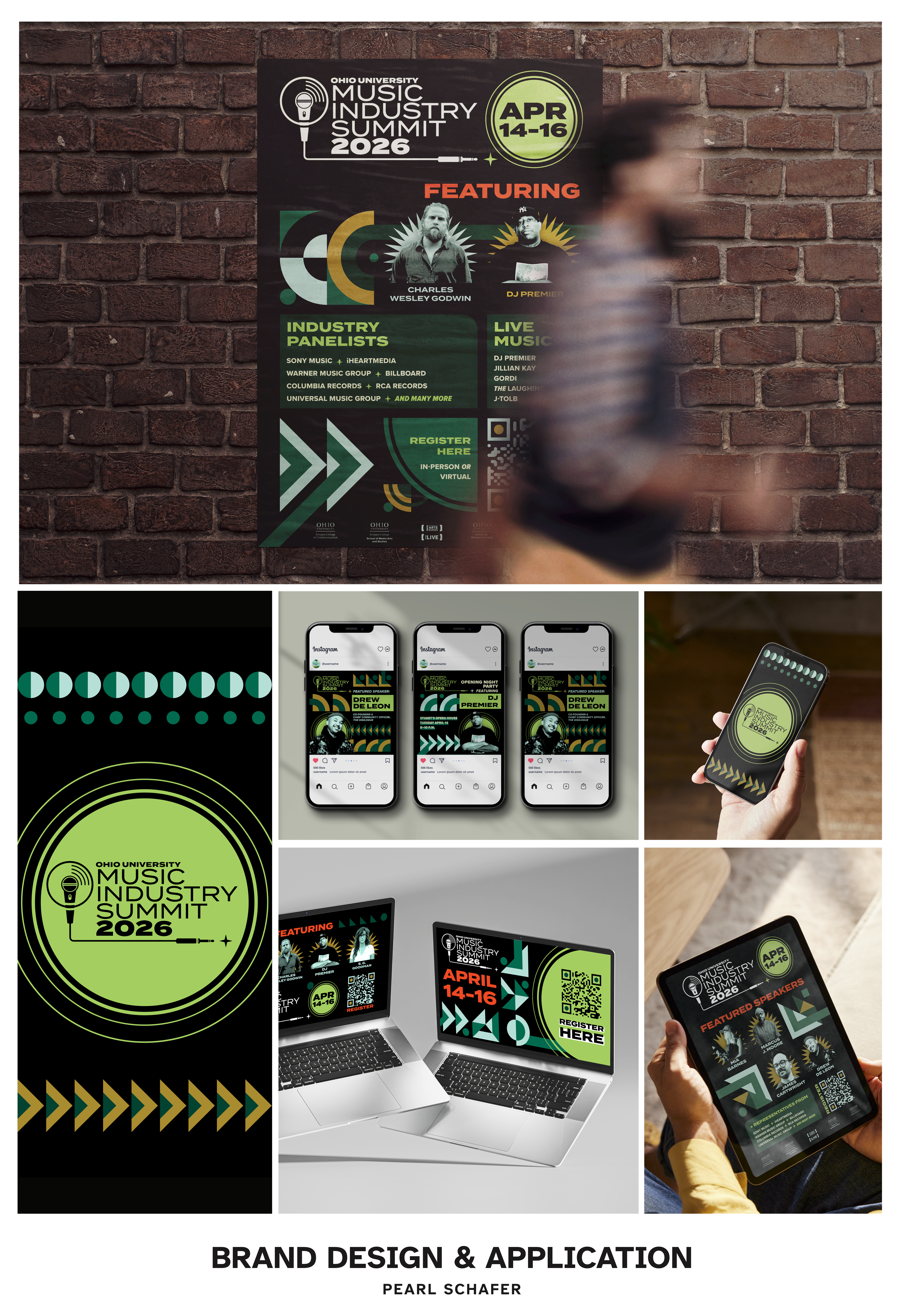
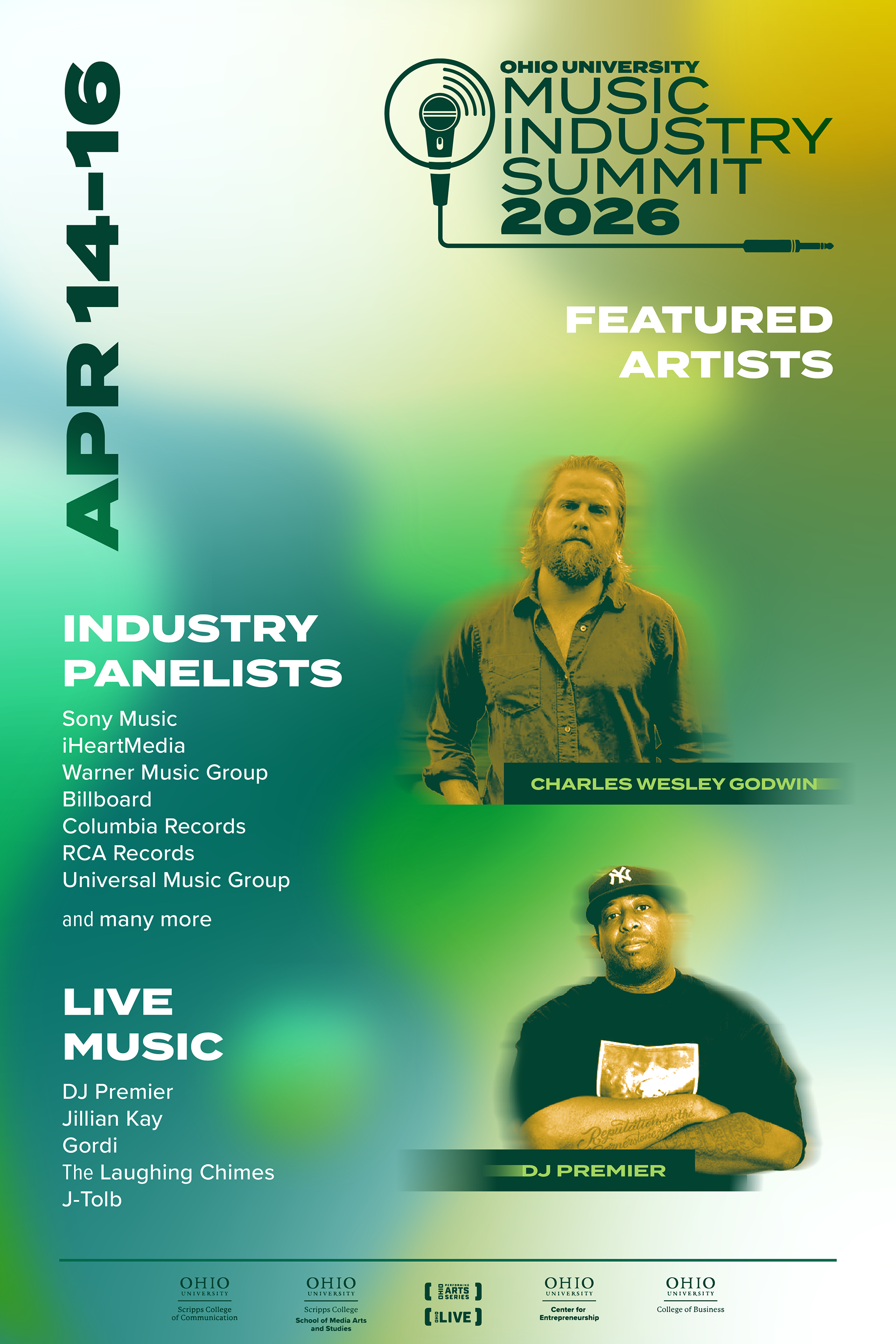
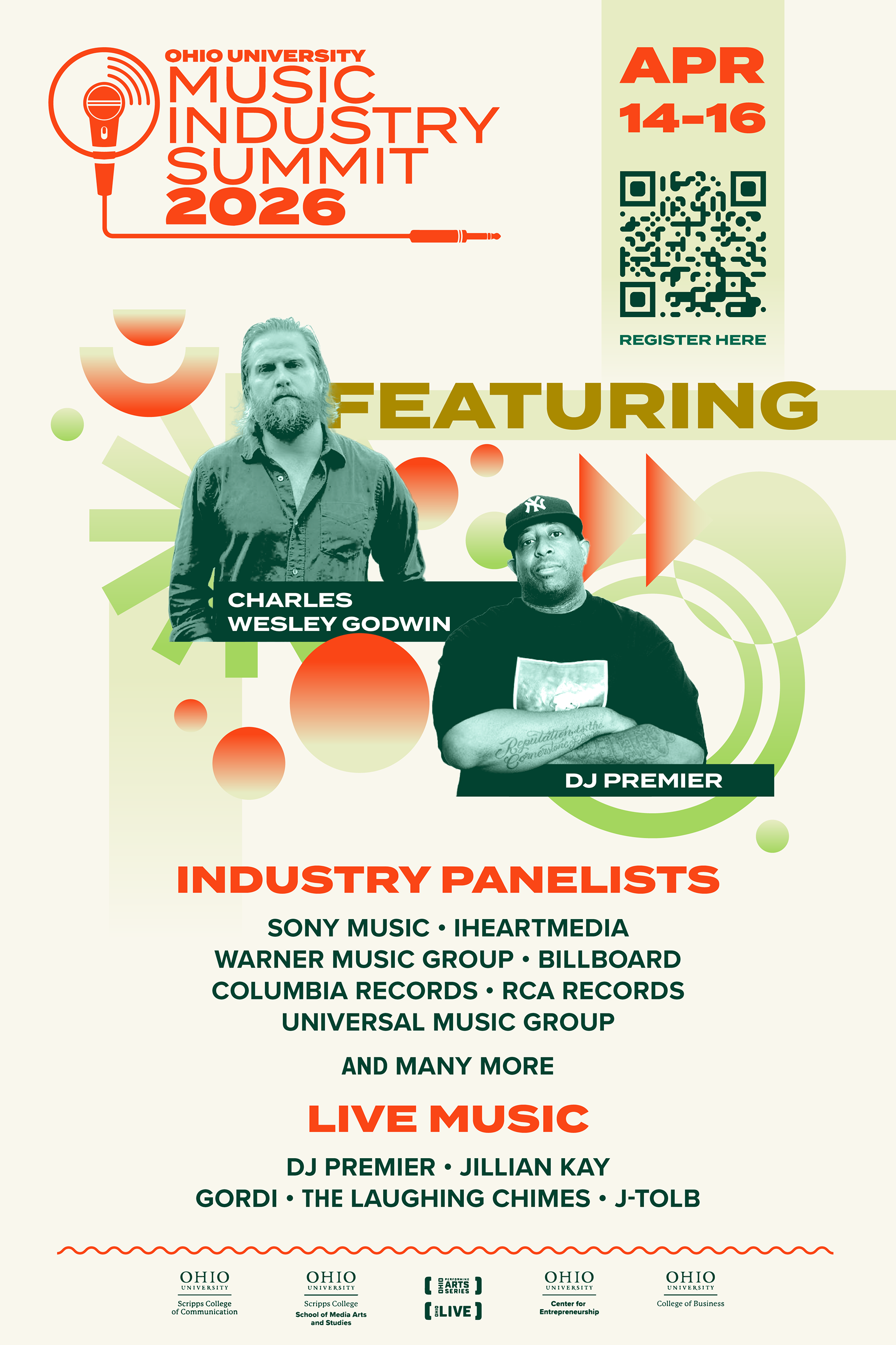
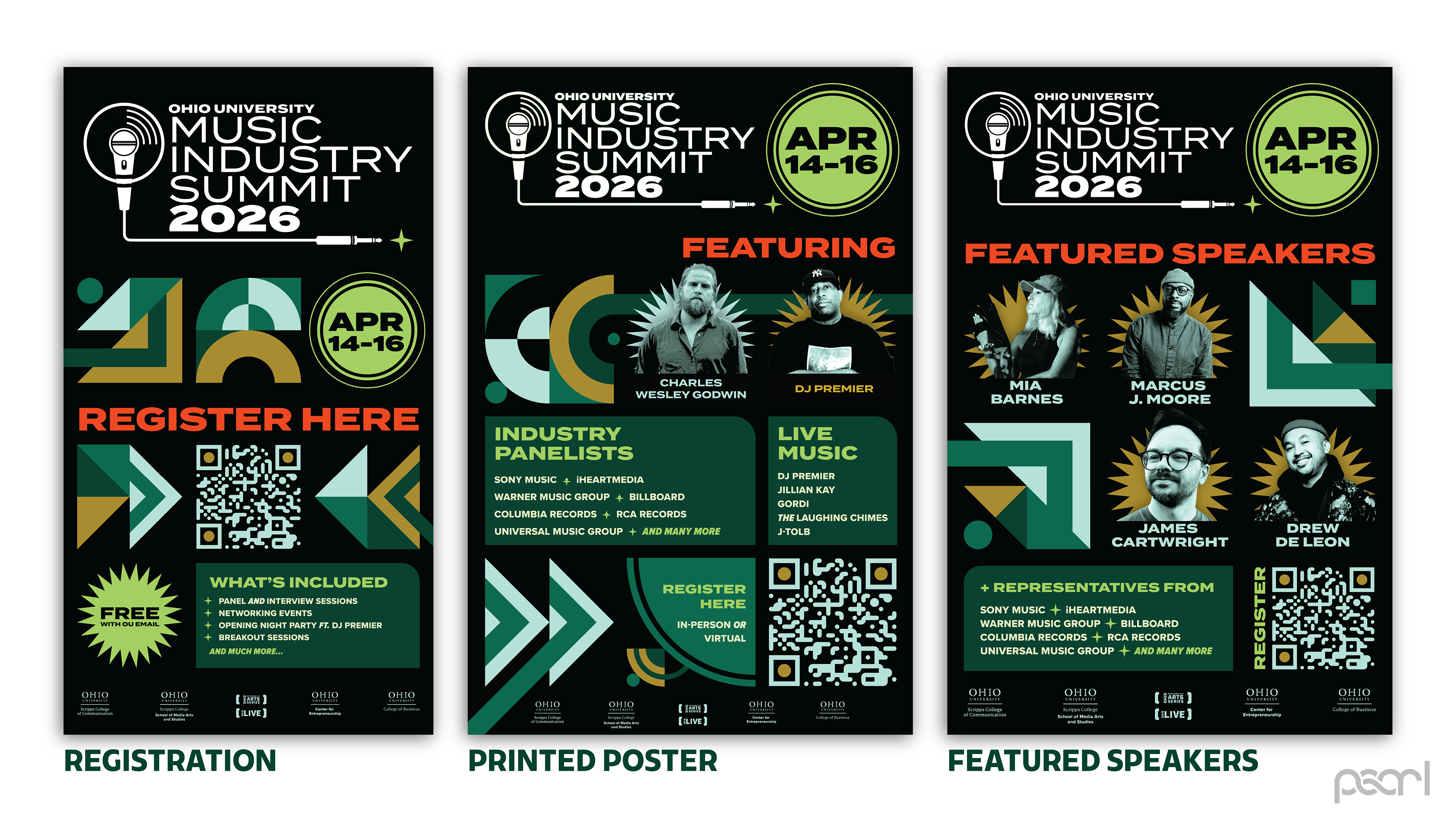
I pitched the following materials to the client, starting with the print materials. The graphics share certain commonalities that unite them and increase readability.
Geometric shapes are used as directional elements. White is used solely for the logo; red is used for easily-scannable headers. Ornaments use muted blue and gold. The green radiating circle appears across all materials.
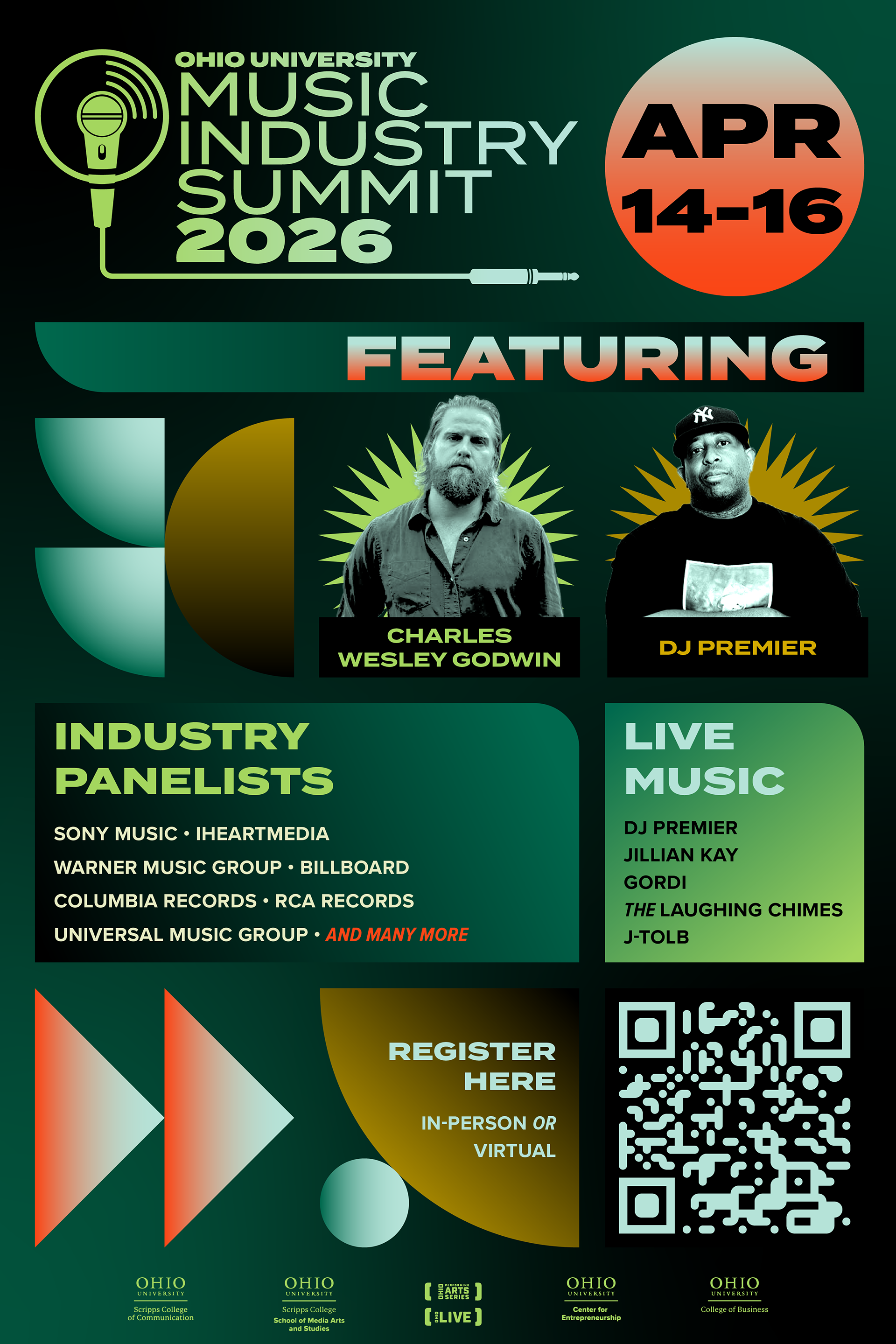
Digital applications require even more ease of scanning, so I further simplified these designs by using exclusively blue or gold, increasing simplicity while offering variety.
For mobile applications, the theme can be reduced to its bare components: the geometries and the recurring green circle.