
SUMMARY
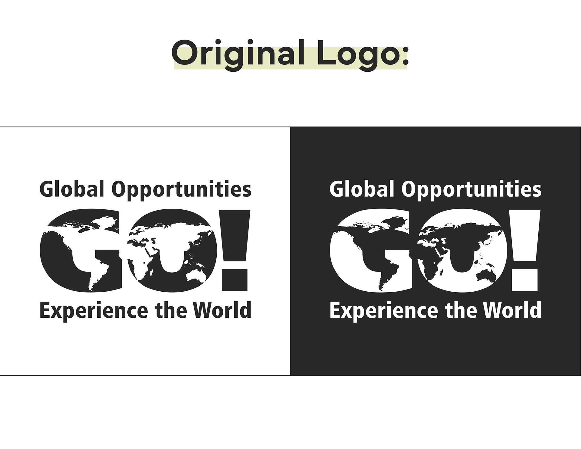
To help promote the Office of Global Opportunities, I offered to redesign their logo with a more simplified, modern approach in mind.
PROCESS
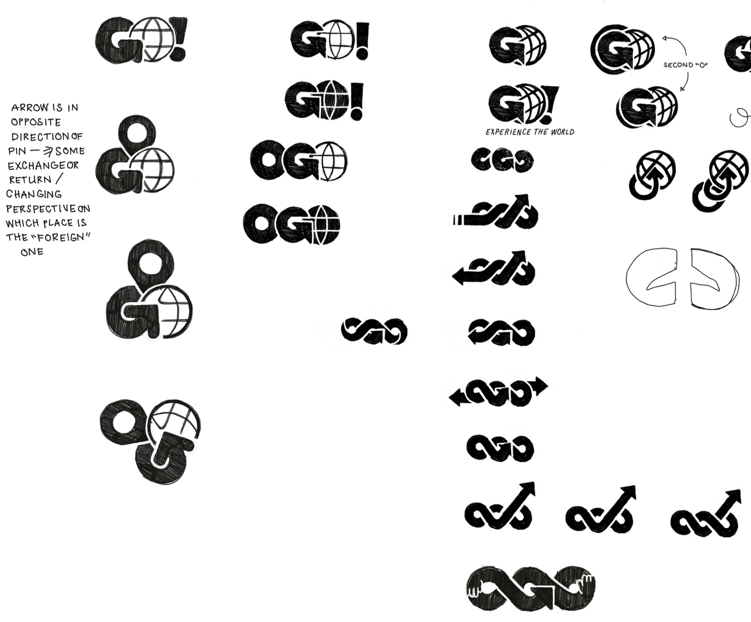
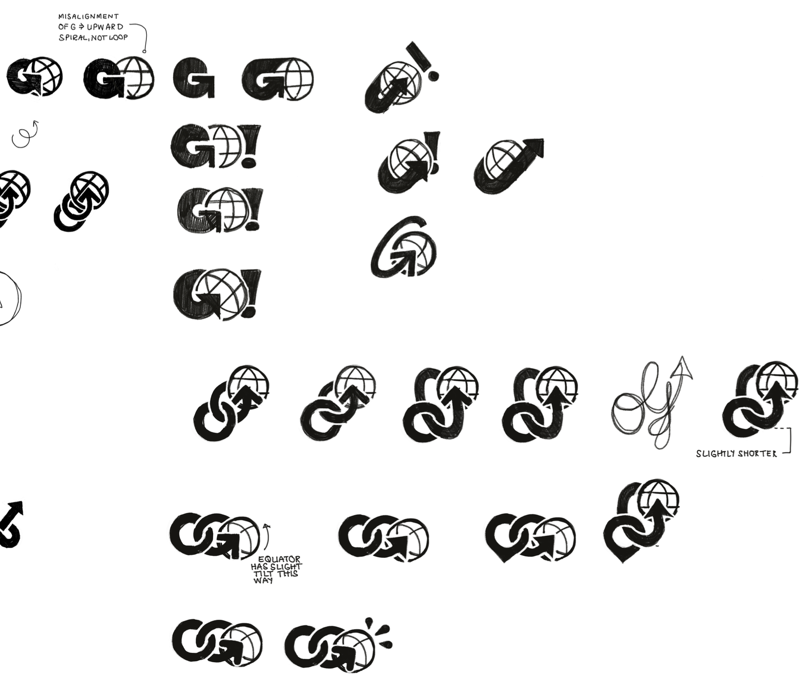
I wanted to preserve the double meaning of the original logo (“GO” as in Global Opportunities) while implementing a more simplified style.
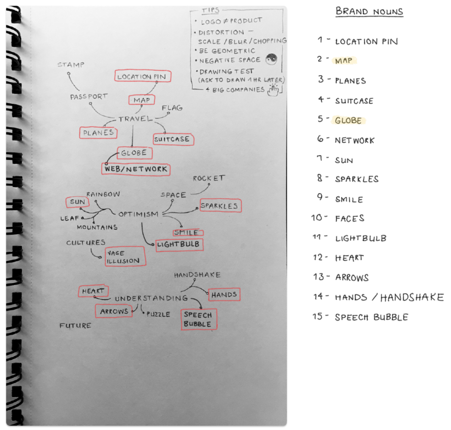
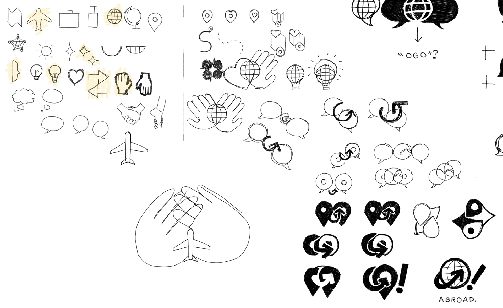
I began by sketching travel-related icons and exploring how they can relate to one another visually.
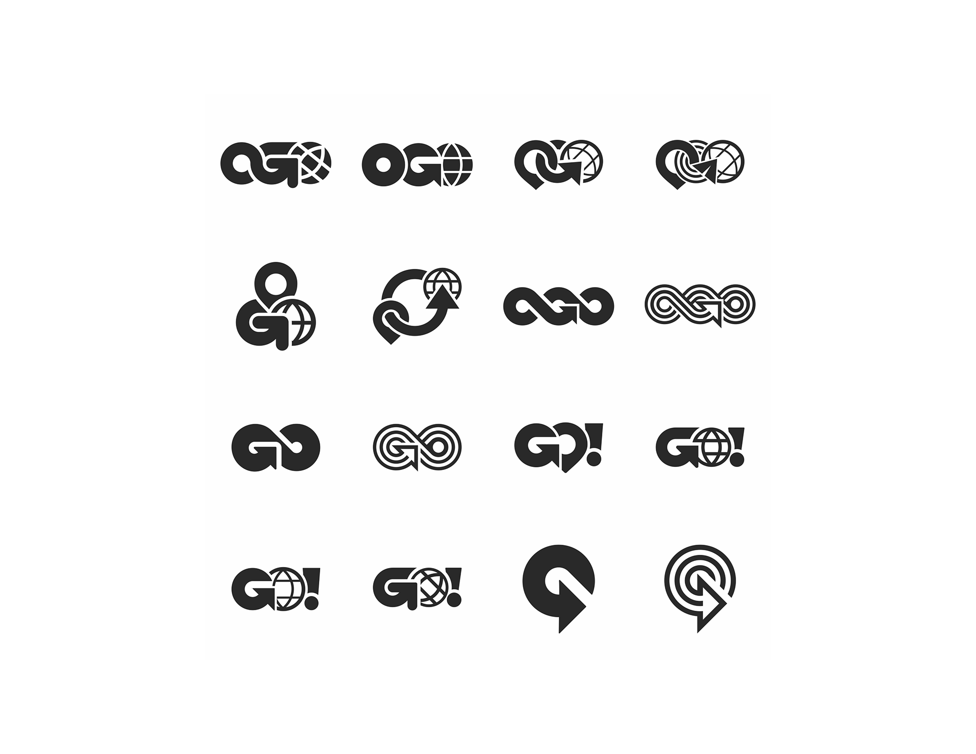
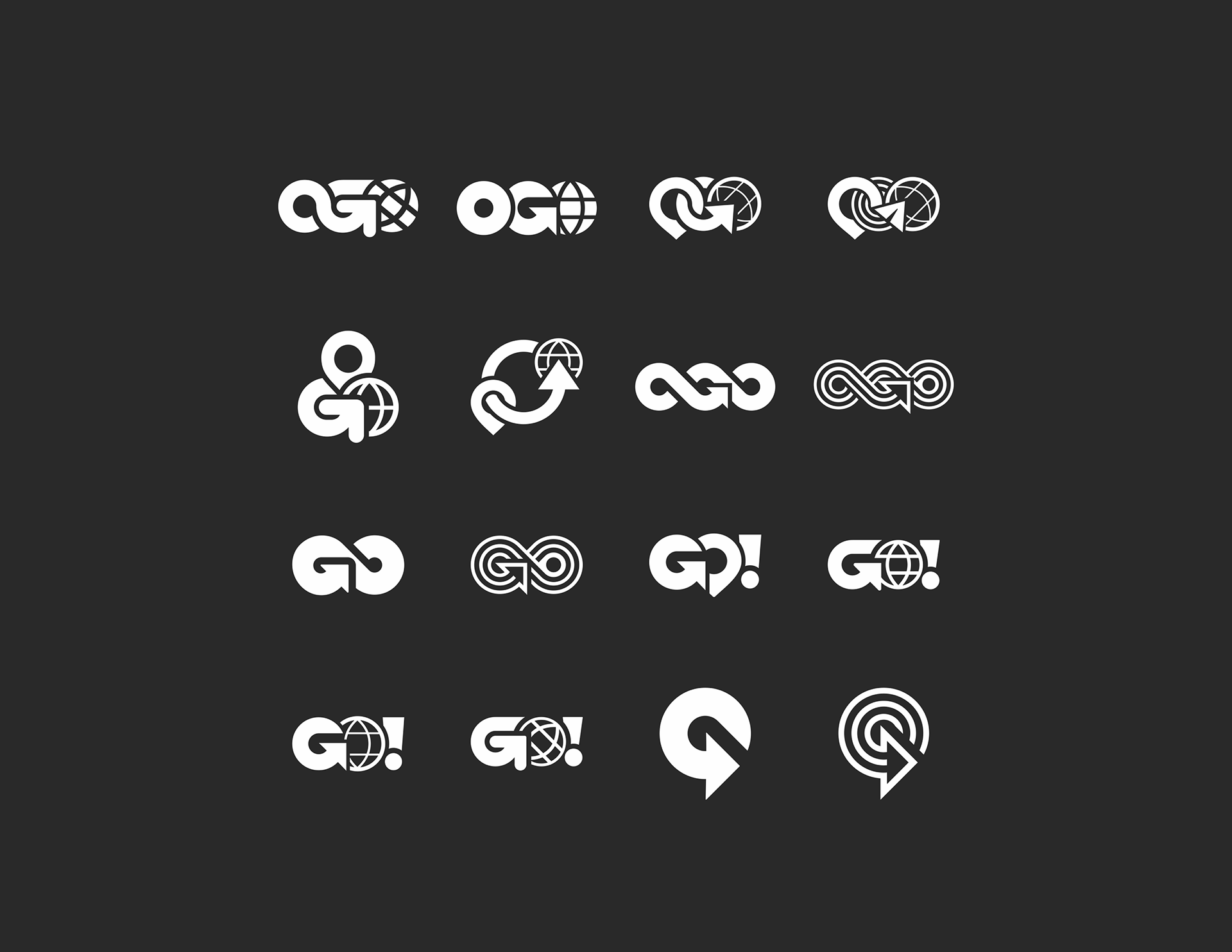
I chose the 16 strongest concepts and vectorized them. I pitched these to the client, explaining the message and tone behind each.

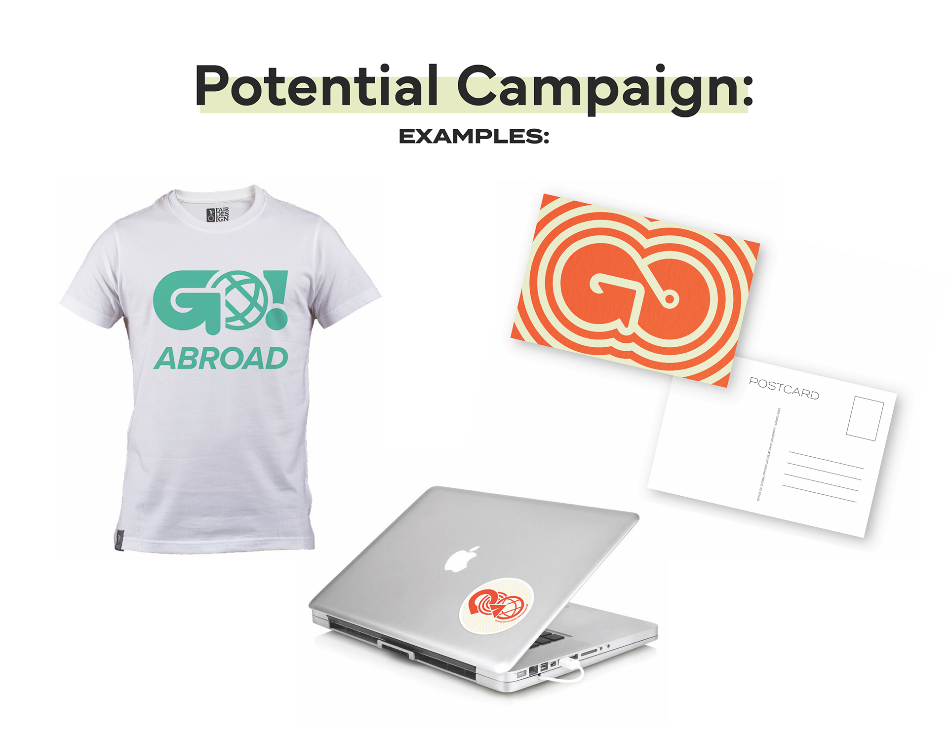
I offered ideas for how these logos could appear in various campaigns.
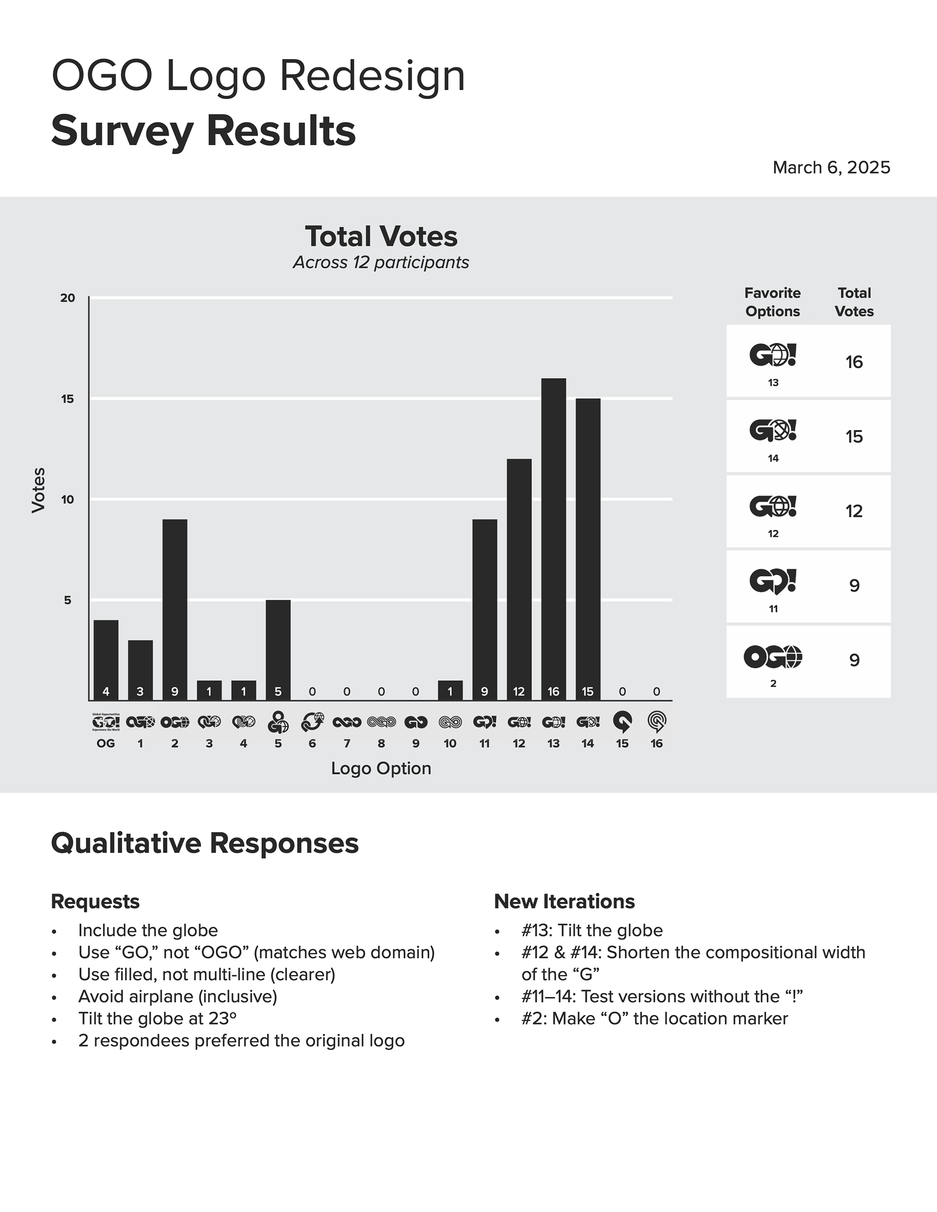
The office and I conducted a poll to find which options students and faculty favored. I visually presented these findings to share with University Communications & Marketing.
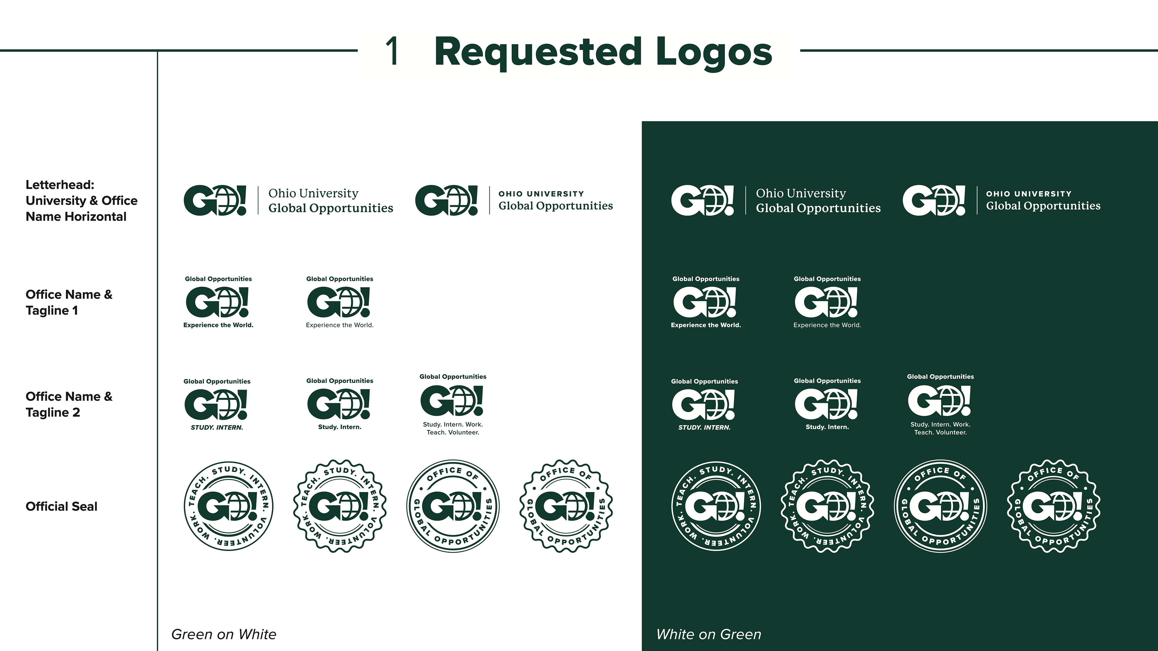
After making a final decision, the office requested a full logo suite, including a letterhead, two primary logos, and an official seal.
RESULT
The logo has been approved and used across all applications.